Welcome to the online blog for a film publicity campaign for a new slasher horror, Obsessed. This blog is an online diary, which evaluates the process and outcome of our production work, this also shows the process of creating a marketing campaign for the film, from concepts to final products, such as a teaser trailer, film poster and film magazine. This also evaluates our final production and highlights what codes and conventions were used.
Monday 7 December 2009
Friday 4 December 2009
Evaluation Question 4
3. How did you use new media technologies in the construction of your research, planning and evaluation stage?
In our film marketing campaign we used new media technologies throughout the research, planning and the evaluation stages. The internet was the main new media technology we used to contstuct our research, as we found out most of the information on our real life story, which we based our movie on. It also helped our planning and evaluation, as we was able to observe exsisting film marketing campaigns, and develop or challenge conventions. For our teaser trailer we used a digital video camera to record our footage, as well as a digital camera to take still images for our film poster and film magazine, and uploaded the footage and the images to an apple mac computer with a firewire. We then edited the the footage using iMovie. Using this programme we was able to delete clips that we didn't want or need, add sound effects and non-copyrighted soundtrack. Our teaser trailer soundtrack was downloaded originally from a free music website called www.freeplaymusic.com.

We also downloaded our sound effects such as, the heartbeat and the typewriter from the same website. Our production details were edited in photoshop, then imported into iMovie. After our teaser trailer had been edited to a standard quality that we was satisfied with, we converted the file into Quicktime and uploaded it onto our blog.
We took still images with the digital camera, whilst we were filming the teaser trailer. These were also edited in photoshop. We made sure that we edited the images so that they corresponded with the teaser trailer. We then decided what image would be suitable to use for the film magazine and film poster. The mast head and straplines font on the film magazine were downloaded from a free website called www.dafont.com , as well as the title of our trailer and teaser film poster.

With all the production work done, we uploaded the teaser trailer and the film poster and magazine onto our online blog. We considered as a group, that all the new media technologies is an advantage to our marketing campaign, as we could upload our directors commentary, audience feedback and teaser trailer on www.youtube.com, where an establishing audience could comment on and give us feedback for our marketing campaign.
Evaluation Question 2
2. How effective is the combination of your main product and your ancillary task?
Our market campaign is clearly succesful, as we used effective promtional tools such to ensure that our products were nationally and globally promoted, to attract our potential target audience, which are older teenagers, as well as aspiring adults. The aim of our teaser trailer was to spread a viral marketing campaign; as the teaser trailer creates mystery, therefore attracting an audience that wants to further their knowledge in the film. They would do this through various media technologies, such as facebook, youtube or twitter. Hopefully through these media technologies, it will spead through word of mouth, therefore creating an establishing audience for when the theatrical trailer, poster and magazine articles are released.
Our market campaign is clearly succesful, as we used effective promtional tools such to ensure that our products were nationally and globally promoted, to attract our potential target audience, which are older teenagers, as well as aspiring adults. The aim of our teaser trailer was to spread a viral marketing campaign; as the teaser trailer creates mystery, therefore attracting an audience that wants to further their knowledge in the film. They would do this through various media technologies, such as facebook, youtube or twitter. Hopefully through these media technologies, it will spead through word of mouth, therefore creating an establishing audience for when the theatrical trailer, poster and magazine articles are released.
I feel as if the teaser trailer and the poster compliments eachother greatly, as the poster being released a year before the films release. The teaser trailer is also released before the theatrical trailer. We as a group felt that it was important that the poster and the trailer both created the same sense of enigma, which is to withold the protagonists face. We decided to use this convention as our promotional tool so it became USP. We ensured that this was conveyed through the poster, magazine and teaser trailer.


Thursday 3 December 2009
Evaluation Question 1
1.In what way does my media product use, develop or challenge forms and conventions of real media products?
Teaser Trailer
In our teaser trailer, we developed and challenged the forms and convention of existing media products by not using a voice over in our teaser trailer. As a collective group we decided not to use a voice over, as we believed that it would reveal too much of the narrative. This is similar to the teaser trailer 'A nightmare on elm street', this teaser trailer did not use the convention of a voice over, and we found that it was effective, as it kept the audience in suspense and craving to know more about the narrative. The conventions of a teaser trailer is to tease the audience and also to market the title of the media product via word of mouth or through the internet. In the teaser trailer 'A nightmare on elm street', the tease is not being able to see the protagonists face, which entices the viewer into wanting to see the killers face and what he looks like. As a group we decided to incorporate that convention and not show our protagonist face from the beginning of our trailer. For example, our first shot is the back of our protagonists head, which is consistent until you see the first victim in the trailer.

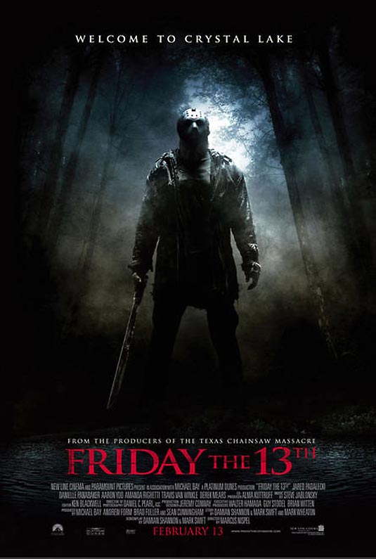
In further research of teaser trailers, we found that most of the killers were potentially male killers and wore masks or had some kind of deformity, such as, Freddy kruger (a nightmare on elm street) and Jason (Friday the 13th), and we decided to follow this convention and give our protagonist a hidden identity by using a mask.
Film Magazine Front cover
Our film magazine front cover develops the conventions of existing film magazines by using our protagonist as the main image for our front cover. After researching into exsiting film magazines such as, Emipire and fangoria, these magazines influenced our film magazine front cover greatly. Conventionally, a film magazine would have a mid shot or a close up of the main image, but we decided to use a long shot in order to have the full view of our protagonist; following the convention of the empire magzine.
Film Poster
We also looked into horror coventions of a film poster, and the main convention that captivated my attention was the protagonist in an establishing shot, such as standing outside a creepy looking house or a dark forest, such as, friday the 13th and a nightmare on elm street. This contrasts to our film poster, we decided to challenge this convention by placing our protagonist on a plain black background with blood splattered on the wall; this highlights our movie genre as well as sticking to horror conventions. We also found that the most conventional colours of a film poster is red and black, as it signifies blood and darkness.
Saturday 28 November 2009
Audience Feedback
As a group we decided that it was it was important to gain audience feedback as well as it being a requirement. We created a Facebook account as we thought that it was one of the most successful new media technology that would attract our target audience. The account included pictures from the filming day, to the production work and teaser trailer. Facebook allowed our audiences to become a fan of our movie as well as leaving constructive criticism and positive feedback. These comments would enable us to make changes and improvements to our production work, in order to appeal to our target audience.
From the audience feedback, we gained valuable knowledge. We found out that our teaser trailer incorporates similar conventions of those of an exsisting slasher horror trailer. This allowed us to see that the audience had a clear understanding of the genre. We also found that in an audience feedback interview, we payed attention to the detail of the teaser poster, such as the editing in photoshop. They even compared the grayscale from the film poster to the Blair Witch Project.
-Screen grab facebook profile-

To view facebook account Click Here
From our feedback there were some comments that frequently came up:
- Our USP was obvious as you didn't see the protagonist face in either of the products
- It was clear which target audience we were aiming for.
- It created a sense of enigma.
- Well filmed and edited.
- Good at concealing killers identity.
- Soundtrack creates a scary atmosphere therefore highlighting the genre.
We decided that our facebook account wasn't enough audience feedback to act upon, so we decided to create a youtube account and upload our teaser trailer on to it. We also uploaded video interviews of people in our target audience, filming there response to our teaser trailer.
Click here to view interviews:
http://www.youtube.com/user/ObsessedMovie1
http://charliejoseph.blogspot.com/2009/12/evaluation-question-3.html
http://charliejoseph.blogspot.com/2009/12/evaluation-question-3.html
From our audience feedback, it was clear that we had created a successful teaser trailer that attracted a target audience that we intended.
Friday 27 November 2009
Facebook and Twitter Links
In order to promote our marketing campaign, we decided that it was a good idea to start a fan base to get an audience feedback for our slasher horror trailer as well as our ancillary task.
To become a fan, visit our facebook:
or
to follow us on twitter:
Thursday 26 November 2009
Questionnaire
1. Name three things you enjoyed about the teaser trailer.
.
.
.
2. Did you think our killer was convincing?
3. Why?
4. Did you notice any conventional aspects of a slasher horror movie trailer?
5. What were they?
6. Was our victim convincing?
7. Did the length of the trailer have any impact on your viewing?
8. What did you think about the pace of the trailer?
9. Was the narrative clear?
10. Would you want to go and watch this movie in the cinema?
Tuesday 24 November 2009
Sunday 22 November 2009
Filmworks logo
In every teaser trailer before they show the actual trailer, or in some point in the trailer they highlight the name of the company that produced the trailer. The name of the company in our teaser trailer is the first shot you see, so we had to make sure that the filmworks logo captured the audience's attention long enough for them to remember the name of the company. Here are a few idea's of the creation of the filmworks logo:

We then decided as a group to go for a logo which is simple to read, yet memorable and stylish.


Friday 20 November 2009
Obsessed title ideas
We found a variety of fonts to use for out slasher horror title. We wanted to find the one that would portrayed our slasher horror theme the best. We then went on on a website called Dafont.com, as it had different font styles to choose from, as well as using Adobe photoshop to edit the colour of the font.
As a group we decided that this was the most effective title to use for our trailer, as we thought that it represented the youth effectively by the calligraphic style of writing which could represent the carelessness and innocence of the the teens, as well showing the bloodshed and horror by the splatters of ink around the edges of the title, in the slasher horror trailer.

These are some of the other ideas that we came up with for our title:

Sound Track for Teaser trailer
I was in charge of making the sound track for our teaser trailer. I decided to use a programe called garageband, as I knew that it would have all the sounds that were relevant to use for a horror teaser trailer soundtrack.
The sound is very important in a teaser trailer, particularly the music, which swiftly manipulates our emotions and creates an atmosphere. The voice over, a feature of advertising, is used to tell the story and emphasise the credit information where appropriate. Like every other element of a teaser trailer, the voice over also looks to promote the film by building our anticipation.
As a group we decided not to use the sound track I made as it didn't give coresspond with the trailer, neither did it reflect the slasher horror genre we wanted. We then ended up looking for a non-copyright soundtrack on a website called http://freeplaymusic.com/.

After hearing the soundtracks on this website we chose a horror instumental, which we believed gave the trailer an eerie effect, also celebrating the genre. But we found that the music celebrated the protagonist in a positive light instead of portraying him in a psychopathic and obsessive light. We search the site over once more, and we found a soundtrack that was perfect for the trailer as it had all the horror conventions a soundtrack needs in order to celebrate the genre.
Thursday 19 November 2009
Synopsis
 Our film is based on a young boy, Peter, who has always had difficulty fitting in with children his own age. He is fifteen and has never really had any friends. He spends most of his time at home on his computer and is fascinated by famous killers such as the Camden Ripper and the West's.
Peter longs to be noticed, but for all the wrong reasons. He wants his name to be known across the world and he believes the only way of doing so is by committing a mass killing at his school. Peter watches his victims over a number of days, analyzing their every move and planning his attack. he is careful and secretive as he does not want his plan  to be unveiled before the killings take place. He invites his selected victim to an 'Award Ceremony' in the gym of his school where he plans to carry out the attack.
First to arrive is Sarah, a pretty and popular girl from his year group, who has dressed up for the occasion. As the enters the room the lights go off revealing Peter who emerges from the shadows. He repeatedly beats and tortures her with a basketball before hanging her from a gym rope. We are left with an image of a basketball bouncing across the gym, covered in blood.
Peter's other victims are found dead one by one across his school. They take place in the space of a week, and still Peter hasn't been found out. It isn't until his last victim is dead that he waits for the school to open the next day and is inevitably caught. He falls asleep next to his victim, covered in blood. When they discover him the next day, he seems pleased to be caught and is finally happy, now that everybody knows his name.
Wednesday 18 November 2009
Storyboard
This is the Original storyboard, which was drawn by one of the members in my group. This storyboard was a solid base from which we was able to have an idea of what our trailer could look like, as well as the order sequence of each shots.

Sunday 15 November 2009
Final film magazine front cover
This is the Final film magazine:

Click the link below for:
Research into film magazine front covers
and
Saturday 14 November 2009


Friday 13 November 2009
Film Magazine stages
-Original image-

-Black and white-

- Effects-

-Final Image-

-Magazine Front cover 1st draft-

-Final Magazine-

To view the Making of the Magazine front cover, click the link below:
Film Magazine Comparison
A member from my group decided to take on the task of making a Film Magazine front cover as part of our film campaign. As you can see they have observed a front cover of an existing magazine called EMPIRE and have used some of the conventions to create our own film magazine front cover. The main photo used in our film magazine front cover is a mid shot photo, which resembles the main photo in the exisisting magazine, as well as the contrast and lighting. The title used in our magazine is also similar to the exsisting magazine as it uses a similar font style, but it is arranged differently. The use of different font styles and sizes highlight our movie, as well as using other conventions from the exsisting magazine front cover, such as, circling important information that would be in the magazine and placing a bar code on the bottom left hand corner.


Saturday 7 November 2009

Film poster Ideas
We were asked to create a Film poster as part of our marketing campaign. As a group we took a range of images to work from.

As you can see it has been edited into black and white because it complements the white mask, highlighting the fact that his face is covered. The camera is at a low angle shot, showing that this killer is in power and intimidating.

This has also been edited into black and white. We agreed that using a black and white image was very effective for a film poster because it allows you to manipulate the contrast and the lighting of the image very easily, allowing you to create the image that you desire. This is another low angle shot, demonstrating his authority as a killer.

This is a close up of the killers face, with a very dark background. Again we have used the Black and white effect. Unlike the other pictures above this is a close up of the killers mask and it is only half. This creates mystery in the teaser poster.
These are a range of still images we also chose to work from to create the film poster or film magazine.

After looking through many of the still images that was taken by us, we came across a very interesting picture that had the commonalities of a teaser film poster. This image is only half of the protagonists face which symbolises that he has a split personality.We decided that we would leave the image as black and white because it enhances the killers menacing look. This image has been edited by using Abdobe photoshop to give it a more sinister effect.
-1st drafts-


The red font brings the audience's attention to the title of the film poster, and the bloody hand print also signifies the gore that will occur in the movie. The black and white shows the sinister and menacing side to the protagonist. However, the black font blends in with the film poster and hasn't got much of an effect on the audience and it doesn't explain the story.
-Final film Poster-

As you can see, we decided to go for a black background with red blood splattered on the wall behind it as it suggests the genre of the film. We then added a tagline as a promotional tool, to motivate the audience to see the movie.
Monday 2 November 2009
Research into Film Production Logos
This is a major film production company called Warner Bros. Pictures. This film company produces a wide range of genres, ranging from drama and comedy, to Horror and thriller. This is a popular film company as it caters for different audiences, such as teens and aspiring adults, to many other generations.

Universal is another major film production company, as it also has a range of different genres. Universal and many other major film companies, cater to their audience at different times of the year, for example, horror movies are likely to be released around october and novemeber. The reason for this could be because it is nearer to halloween, which is associated with horror.

Twisted Pictures is a production company, mainly creating films of the horror genre. It gained attention through the production of the horror series SAW. As this company is fairly new, it has created a succesful established audience through the SAW series.

Columbia pictures is a major film production company as it produces and distributes a range of movie genres. It happens to be one of the leading film companies in the world. As this film company is very popular, the audience automatically have high expectations of their films, for they have been around so long and produced a varitey of films.

Universal is another major film production company, as it also has a range of different genres. Universal and many other major film companies, cater to their audience at different times of the year, for example, horror movies are likely to be released around october and novemeber. The reason for this could be because it is nearer to halloween, which is associated with horror.
Twisted Pictures is a production company, mainly creating films of the horror genre. It gained attention through the production of the horror series SAW. As this company is fairly new, it has created a succesful established audience through the SAW series.

Columbia pictures is a major film production company as it produces and distributes a range of movie genres. It happens to be one of the leading film companies in the world. As this film company is very popular, the audience automatically have high expectations of their films, for they have been around so long and produced a varitey of films.
Friday 30 October 2009
Research into Film Posters


As part of our marketing campaign, we was asked to create a Film poster for our film. In doing so, we as a group researched into horror teaser Film posters to base our ideas on and have a feel of what a horror poster looked like. As you can see, most of the posters have dark backgrounds with the protagonist as the centre of the poster, it uses a variety of shots, such as, mid shots, long shots and close ups. This gave us the initiative to use different shot types for our film poster.
Wednesday 28 October 2009
Research into teaser trailer
In class we have been looking at teaser and theatrical trailers and analysing the function of a voice over as a Group, we agreed to base our teaser trailer on real life events, massacres and killings. My idea of a teaser trailer has to be able to have the ability to capture an audience's attention and hold it for a short space of time, therefore giving them enough time to raise their curiosity but not enough to spoil the story. Here are 2 theatrical trailers that I believed had these conventions:
These trailers had been taken into account whilst creating our own teaser trailer, as well as the film poster.
Tuesday 27 October 2009
Research into killers
Commonalities in a Slasher horror killer:
o Personalities are masked and hidden thus keeping humanity unseen in killers mind or victims.
o Lack or distortion of human qualities.
o Choice of weapons suggests sadistic nature of killing.
o Costume codes show lack of awareness of image and covey isolation from society.
o Body language suggests overriding resilience and strength.
o Sadistic or far off gaze suggest a warped mind.
o Chaos is expressed through the victim’s lack of verbal or non verbal communication with the killer.
o The mask of the killers suggests a unacceptance for the crimes committed by the killer.
o Costume codes make the setting more terrifying.
o Normal everyday objects become menacing in the wrong hands.
The protagonist would have most of the commonalities of in slasher horror killers such as; ‘Personalities being masked and hidden thus keeping humanity unseen in killers mind or victims’ by him having a mental illness which triggers his reaction. The choice of weapons suggests sadistic nature of killing, by him killing people with ropes and gym equipment. Chaos is expressed through the victim’s lack of verbal or non verbal communication with the killer by him not even having physical contact with his victims only when the attack is taken place. Also Normal everyday objects become menacing in the wrong hands due to him doing the killings with rope and gym equipment.
This is the first slide showing the Connotation and Denotation of slasher horror killers:

Protagonist Profile
Name: Peter Wilcox
Age: 16
Education: Highland Grove Community School
Interests: Surfing the internet and jump rope.
Personal Profile: Peter grew up in a small town called Highland grove. He was one of many as he has 6 other brothers and sisters. His mother didn’t know she was pregnant with him until it was too late to get rid of him, so he was a mistake, according to his mother. So whilst she was pregnant with him she drank and smoked everyday without fail. As a result of that Peter was born with a mental illness called sadistissonia – meaning that he had no control over his mental and physical reactions to anger and sadness. The doctors told his mother that it could trigger off at any stage of his life. Due to his illness he didn’t get the attention and love from his mother like the rest of his brothers and sisters. Instead he was isolated and withdrawn from his nuclear family as well as society. There was only one thing that made Peter happy and that was a gym skipping rope. He treasured that skipping rope because it was the first thing his first crush ever brought for him when he was 15, right before she died. She was murdered by a famous serial killer who kidnapped her. She was the only one that Peter ever cared about. Since the incident, Peter developed an obsession towards famous serial killers; he searched most of the brutal killings online, most of them happened to be local. He began to take pleasure in the stories as he read them online, he somehow found comfort in knowing the reasons why they killed innocents. He then became envious of all the killers appearing on the news and headlines. Not realising that the incident had triggered his illness, he read the latest story of a boy killing the whole of his class year just to become famous, using a bow and arrow from the story robin hood. He then began to think about what weapon he could use to do these killings that was easy to get hold of in high school. He then remembered the rope that was given to him by his crush, and decided that that was the best weapon to use to kill students in his year. After his first killing Peter then became obsessed with the adrenaline he felt when committing these killings, on his last victim, he made sure that he fell asleep next to her, in order to get caught in the act. When he was asked ‘why did he commit all these murders?’ He declared “I was giving them the excitement and scandal they secretly craved”
Monday 26 October 2009
Reseach into Film Magazine Front Covers
 As part of the film publicity campaign we had to create a film magazine front cover. In order for our magazine front cover to be successful, we decided to research into existing magazine front covers. In doing so, I believe that it helped in the process of making our own magazine front cover. As you can see in this photo, it is a close up of a vampire, this is effective because it allows you to become up close and personal with the character on the front cover. Looking through most of this magazine's front covers's most of the images seem to be closeups of the character in the image. This magazine is a popular horror film magazine, so by looking at the typography it tells us straight away that this is a horror magazine, due to the sharp edges of the lettering. The stylized typography on the magazine front cover can then give us an insight to what font and image we could consider using for our magazine front cover.
Gorezone magazine is another popular horror film magazine, but this magazine is UK based unlike 'Fangoria'. As you can see, the main image is also a close up of the main character in a movie, but it has been layered so the picture is over the title. This is effective because it draws the reader to the image more. This convention could be applied to our film magazine front cover as it celebrates the protagonist. The typography used in this film magazine is pretty basic, as well as the colours used. This could suggest the target audience of the magazine. Considering the typography and the main image this magazine could be targeted to an older teenage audience that are interested in horror genre's.

Empire magazine is a popular film magazine. As you can see the protagonist is centre of the film magazine. The long shot gives us his full image, showing us that he is in a suit, yet his face is sinister and menacing. The magazine headline is very bold and clear even though the image is over the headline. The typography is brightly coloured and varied font styles, in which it correlates with the protagonist in the main image. This could be applied to our Film magazine front cover as it would reflect the appropriate genre of the movie, as well as attracting the reader to the magazine.
Research and Planning Obsessed
In class we was asked to come up with a film publicity campaign by a London based film company called 'Filmworks', and they want us to create a film concept and marketing campaign for release. We were also asked to consider the audience target age, as the company wanted to target older teenage audiences of age 15 and above, and also widen its audience by also aspiring to independant, creative and aspiring adults. As a result to this we decided that the USP of our film was to base it on real life events that have happened in the past.
We planned some of our ideas onto a brain storm diagram below:

One of my group members was in charge of the research and planning. We came across many different stories that we could use as a slasher horror movie, such as,
(Click on pictures to view links)
-Dr Harold Shipman-

-John Duffy and David Mulcahy-

-Camden Ripper-

After researching these local killers we started to think how we could convert these real life murders into a teen based slasher horror. After conversing about the Local murders, a member of our group decided to base out horror trailer on a real life story, but more teen based. The story was about a boy who craved attention from people and the way he decided to get it was a school massacre. The event took place in a school in america but was then turned into a novel called:
'We need to talk about Kevin'

The novel was written from the mother's point of view. We decided that this was the perfect real life event to base our slasher horror on because we would be able to manipulate the story, enabling it to become a slasher horror.

This is a screen grab from the moview 'Halloween II', this teaser trailer influenced our film poster vastly, as we incorporated the splattered blood behind the text, as well as using the red font and black background. This also resembles our teaser trailer, as our production details are listed similarly.

This screen grab was also taken from the teaser trailer 'Halloween II', this shot influenced our own teaser trailer. There is a shot like this in our teaser trailer of an extreme close up of a victims eye looking around nervoursly.
Subscribe to:
Posts (Atom)
